User Test Report for https://myweb.fiu.edu/calva298/
Prepared by Stephanie Loor for Dr. Vytautas A. Malesh and Carolina Alvarez
April 18, 2026
Introduction
Everybody loves a good movie. I grew up watching films as a family past time, in my grandparent’s living room and some summers, at my uncle’s house in North Carolina. All the morals and lessons implied in the films raised me in a profound way, so when I came across Carolina Alvarez’s charming website, “The Movie Diaries,” the page spoke to me on a personal level.
I’ll be reviewing “The Movie Diaries” here first, so visitors to my site can know what they’re getting into before heading over to this lovely virtual movie room. Think of it as the kind of warm home movie theater in someone’s den or basement. There’s a classic popcorn maker in the corner beside a concession stand with Buncha Crunch and Sour Skittles under the glass. Someone’s mother is upstairs making dinner, and the owner of the movie room—a dear friend—is excited to break down plot summaries and character complexes with you on a chill Saturday afternoon.
What Works, and What Could Be Improved
Upon deeper analysis, “The Movie Diaries” presents opinions and film recommendations in “an easy-to-read, conversational style.” According to the University of Maryland, Baltimore, readers tend to scan pages, so “chunking” content by keeping it to only one topic per paragraph keeps audiences hooked, engaged, and present.
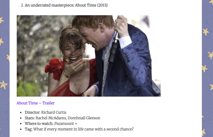
A perfect example of the site’s use of bullet points to list key info is under the “About Time” (2013) film review on the February 8 blog post titled, “Top 4 Films to watch on Valentine’s Day this year!” Audiences get a quick glimpse of vital information such as star actors and where to watch, as well as a link to the trailer so they can check it out while their attention is still focused on the page.
One minor drawback I noticed is long bodies of texts that could have benefitted from being broken up into shorter “chunks”. Katy Cowan emphasizes the importance of providing “easy reading” by inserting “lists wherever possible and break up the text.” Adding bullet points or lists will “hold people’s attention more.” The site author does this sometimes, but then follows the short bursts of lists with too-long walls of text. A simple page break would increase the ease of readability so much.
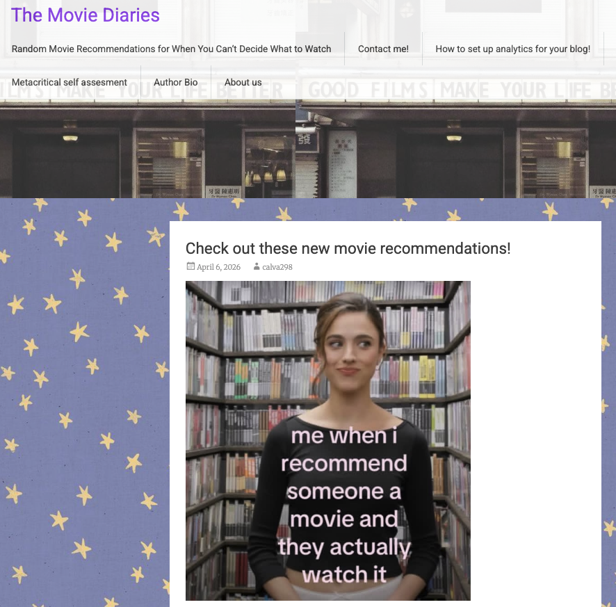
On a lighter note, the site author’s use of screen stills is impeccable. Everywhere you click, you’ll find an accompanying photo brightening up the page. According to the Web Accessibility Initiative (WAI), images and graphics “make content more pleasant and easier to understand for many people… in particular for those with cognitive and learning disabilities.”
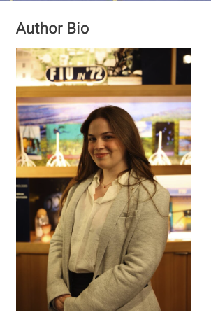
In addition, the images of choice check all the boxes of effective online imagery. In the author’s bio, we see our beautiful site author. Beneath every film title, we see a movie still from that film. Providing images alongside text improves comprehension and helps pique the memory.
Conclusion
“The Movie Diaries” is a breath of fresh air, a joy to read in a modern-day internetscape where beige is the new black and “cool” is a clone of everyone else. The site author’s niche passions are evident and full of joy and whimsy, and she invites the reader into her world for a preview of a variety of her favorite films.
Overall, the site demonstrates thoughtful design choices and beautiful creative direction. By implementing a few choice stylistic changes, “The Movie Diaries” could certainly improve its effectiveness for audiences without losing its distinct signature style.
Recommendations
While the site author created a lovely space for users to kick back, relax, and enjoy some new movies, there are some recommendations I could give for increased site usability.
Here’s my top 3:
- Break up longer sections of text
Some posts run a little long without enough spacing, which can make them harder to read all the way through. Adding more breaks, short sections, or even an extra line of space here and there would make a significant difference.
The site already uses lists really well in certain places, so leaning into that more consistently would keep readers engaged without losing the site author’s tone.
- Keep formatting consistent across posts
When the site uses bullet points to show things like actors or where to watch, it works really well. Expanding a similar structure to more posts would make everything feel more predictable and easier to follow across the board.
- Let visuals and text work together a little more
The images on the site are a huge strength—they make everything feel lively and help bring the films to life. Pairing that with slightly clearer spacing around text could make the overall user experience go a little bit smoother.
Works Cited
Cowan, Katy. “Top Tips for a Successful Blog.” The Guardian, 17 Nov. 2011,
https://www.theguardian.com/culture-professionals-network/culture-professionals-blog/2011/nov/17/top-tips-successful-blog.
University of Maryland, Baltimore. “Best Practices for Web Writing.” Website Manual,
https://www.umaryland.edu/cpa/website-manual/prepare/web-writing/.
World Wide Web Consortium. “Images Tutorial.” W3C Web Accessibility Initiative,
https://www.w3.org/WAI/tutorials/images/.