I am reviewing Theresa Steling’s website, which is called Littherapy and can be found here. The first thing that kinda stood out to me on the home page was that all the writing is on one long page; nothing seemed to be split up. This made the site a bit hard to navigate as there was no home page button.
I then went to the about page, and the content was good, but the formatting really took away from the reading experience. In my personal opinion, if someone is doing literature reviews, then I’d want to see things formatted in an orderly fashion and there to be no grammar mistakes, or I wouldn’t trust their opinions.
I then moved on to the biography, and the same thing occurred: good content, but grammar mistakes, primarily with the parentheses touching the words in front of them. I found it very impressive that Theressa has published a book. I wish there were a link directed to the book so I could view it on Amazon, and if I feel so inclined to purchase it. As well as having the picture at the top of the page would be a good way to start the biography, so people know what you look like without needing to scroll.

I also took a closer look at the pages bar (is that what its called?) the home page was at the very end of the pages. I originally assumed that there was no home tab because I didn’t see it as the first page in the list. It makes it a bit inconvenient when trying to find that home page.
Also, the home page doesn’t go to the original home page; we landed on it went to a different page. This left me confused about where I can find her writing, as the blog tab (a required tab) is also missing. To go and read her writing, I ended up leaving the website and going back to it using the provided link. This is just an inconvenience to the user.
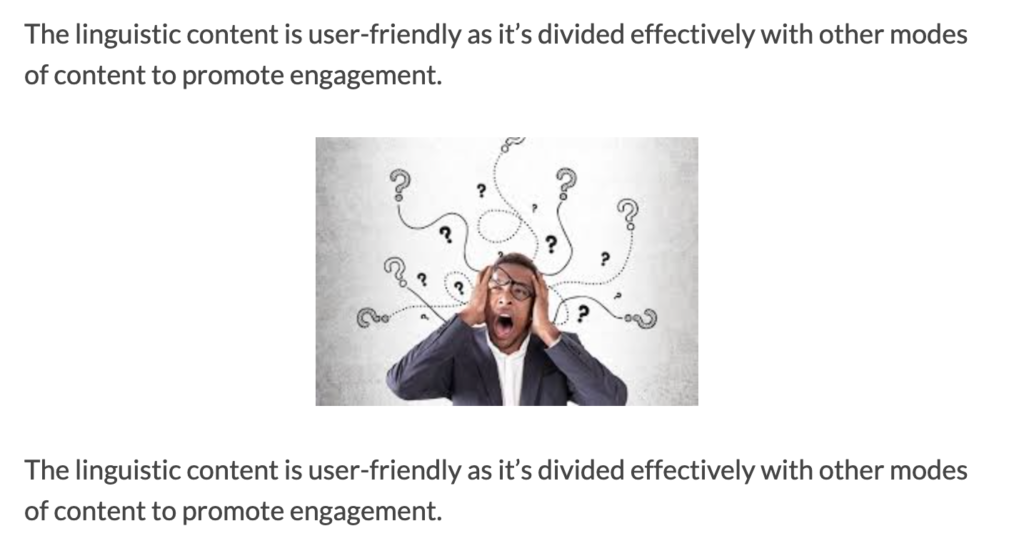
Once I finally found the writing again and started to read, I found its usability was pretty good. It has big bolded headings, shorter paragraphs, images to break it up, and more that has been defined as “good web writing” in this article from the University of Maryland. However, I did notice that some sentences got repeated, like the one above.
The next article I read was “Welcome, My Pretties”. The entire article confused me. I didn’t really know why it was there. It felt like a welcome to my page article, but it was posted March 9th, and there are other articles that were posted before it, so it can’t be that. Overall, I’m confused.
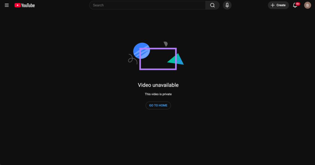
I then read the Welcome video page and tried to watch the welcome video, but I was taken to YouTube, and it said the video couldn’t be found. This means that the video wasn’t linked properly, nor was it embedded, which was part of the instructions. Honestly, a bit happy the video wasn’t working because I was dreading having to go find my way back to the writing.
It took me a minute but I found out the gallery was just all the photos she has used in her other articles. I was a bit confused why she chose those photos at first. Honestly, it’s not a bad decision but I would’ve like to have seen something a bit more original.
Overall my initial reaction to the website was that it’s ok and there is a lot of room for improvement.