


Reviewer: Cheyenne Newfield
Website Reviewed: FinalCutsMedia5
Link to Site: FinalCutsMedia5
Pages Reviewed: Home, About / Vision Page, Author Bio, Review Article Page, Writing Sample, Metacritical Self-Assessment, and Contact.
Introduction: Criteria for Evaluation
I evaluated this website using three main criteria, focusing on content completeness, average usability, and visual/style. Those criteria are what match the goals of good web writing, according to the following guide sworn by writers for decades of the past. Readers should be able to find what they need quickly and efficiently, understand what the site has to offer, and get a consistent sense of the author or brand. Jakob Nielsen from Nielsen Norman Group notes that web users tend to scan rather than read word-for-word, so structure, clarity, and visible takeaways matter a great deal (Nielsen, 1997).
Direct source: How Users Read on the Web – NN/G
What Seems to Be Working Well
In my humble opinion, the site’s biggest strength is consistency of purpose. Across the Home page, About page, and Author Bio, the creator clearly presents FinalCutsMedia5 as a brand focused on visual storytelling, photography, video, marketing, and overall audience connection, which sounds appealing for those in multi-media production and those especially curious about industry. The homepage introduces each major section and explains what readers will find there, which makes the site easy to understand at first glance.
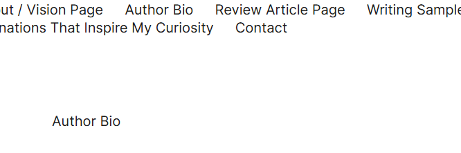
Navigation is also a heavy strength. Every reviewed page includes the same top menu linking to Home, About / Vision Page, Author Bio, Review Article Page, Writing Sample, Metacritical Self-Assessment, and Contact, so users can move through the site without getting lost in the place they are currently reading.
The blog itself is what I consider to be the strongest page on the site. It possesses every satisfactory aspect of proper web writing and exceeds the standards. Not only is it compelling to read, but it’s complemented with related images, bulleted lists, and does more than enough to place the spotlight on the more important details or headers for readers.
Where I Believe the Site Needs Improvement
The main issue I found is that several pages describe the work instead of showing it. As an avid reader, I would never possess any qualms about telling over showing, but we cannot expect the public to share that same sentiment. The Review Article page discusses projects for an event planner and an e-commerce store, but it does not include concrete examples such as actual photos, captions, or any particularly detailed case studies. The Writing Sample page, contrastingly, provides a link that takes you directly to an article published online by the author, which is a job well done. That lack of example tends to weaken credibility because readers are asked to trust the creator’s skill and insight without being provided enough evidence to evaluate it themselves.
A second issue I stumbled upon was contact inconsistency. The Contact page lists a real FIU email and a phone number in the paragraph, but in the larger image, the phone number is slightly different in the amount of numbers. Not only that, but the footer area on multiple pages still shows placeholder information like “123 Example Street,” “hi@example.com,” and “(123) 456-7890.” That inconsistency appears on the homepage, About page, Author Bio, Review page, Writing Sample page, Metacritical page, and Contact page. It unfortunately condemns the site to keeping that unfinished feel and could potentially reduce a user’s trust.
Example: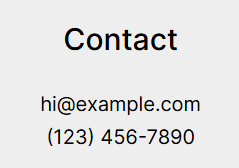

On the topic of inconsistency, I discovered a style guide inconsistency in the mix. When visiting each page, the title of the page listed at the top is left unbolded, except for the About Page, which is bolded. Neither is correct or incorrect, but keeping every nuance uniformed is essential for branding in general, and can only improve the author’s ethos.
Example: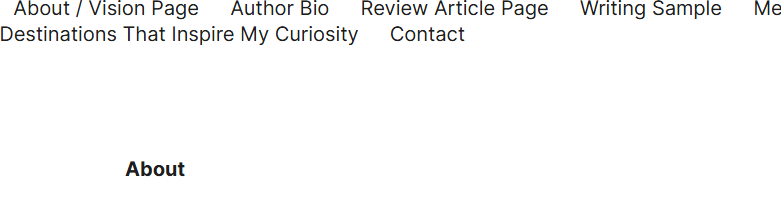
There are also a few smaller clarity issues, but ones that can be rectified easily. The Metacritical page title is misspelled as “Metracritical,” and some sentences across the site could be tightened or broken into more scannable chunks.
Example:

Furthermore, the Writing Sample page has useful ideas, but bullets or labeled sections would make it easier for readers to scan quickly. Every page is short and to the point in terms of overall length and reading time, but users may see the first sign of 3+ sentence paragraph format and get spooked without reading much of it at all.
Recommendations
The first priority should be replacing all placeholder footer contact information with one consistent set of real or fake details. It is completely up to the author’s discretion, but that one aspect alone would tighten up the site greatly.
The second should be adding proof of work:
- – a real writing excerpt on the Writing Sample page
- – actual visuals or mini case studies on the Review page
- – more page-specific examples showing results and not just descriptions of results
The third should be polishing presentation and literacy:
- – fix the “Metracritical” typo
- – break up longer paragraphs into shorter lines
- – add more bullets or subheadings where appropriate
Final Assessment
FinalCutsMedia5 already has an extremely solid framework regarding clear navigation of pages, a coherent and very obviously calculated brand voice, a professional aura, and a strong understanding of audience-centered design. What it needs now is not a total redesign by any means, but a move from what currently appears to be promise to real proof. Once the site replaces placeholders and shows more actual work, it will feel significantly more polished, credible to any persona in the target audience, and far more persuasive.