
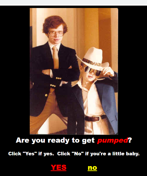
I don’t feel I really had a choice here
A Step Back in Time
I first encountered Realultimatepower.net sometime in the early 2000s – I was working at a dot-com answering phones and logging customer calls, and a friend (via AOL chat) asked me if I wanted to see something totally freaking sweet.
Of course I did.
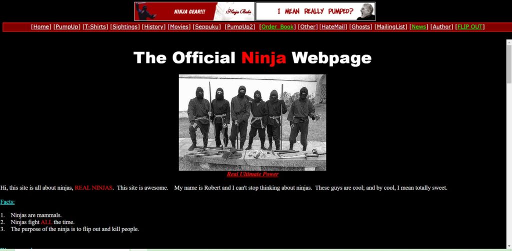
A few moments later I received a link, clicked it, and immediately blasted my cubicle neighbors with a midi version of Jay-Z’s Big Pimpin’ and saw the headline: The Official Ninja Homepage.
Real Ultimate Power has aged extremely well given its nature – that of an anachronistic out-of-date web page at the time of its creation. Although the early 2000s were “forever ago” in an Internet context, web writing and design at the time had evolved significantly beyond the black-background / white text / 600×800 resolution image stage of the Geocities era of a few years before.
Robert Hamburger, the pseudonymous site creator, clearly knows what Real Ultimate Power (henceforth: RUP) is and what it’s meant to do, and it persists as clever media commentary to this day. Idiosyncratically, it’s pretty good for a “bad” website, and contemporary web writers can learn a lot about what to do, and what not to do, by reading it.
Looks, Words, and Links
In terms of education-by-evaluation, I want to consider three things: the look of the site, the language used by the author, and the overall site utility – that is, how well does everything work together.
My primary cypher is the readily available web writing guidelines provided by usability.gov, but I have a few books I’ll be referencing along the way: Darlene Maciuba-Koppel’s The Web Writer’s Guide, Lynda Felder’s Writing for the Web, and Janice Redish’s Letting Go of the Words.
Ultimately (real ultimately?) I want to point out what Robert Hambuger gets right about RUP by underscoring what he deliberately gets wrong – as any ninja knows: you have to know the rules before you can break them!
Looks
White text on a black background can over time lead to some trippy optical effects. Although “dark mode” is by some accounts environmentally friendly, prolonged staring at darkened high-contrast text can wind up giving you a case of the swirls when you look away – RUP is no exception.
Throughout the page, the creator mixes fonts recklessly. On one page, Times New Roman. On another? Consolas. On a third? Arial. No real rhyme or reason (though presumably Consolas is used for scripts, but not always). It’s inconsistent, but again, deliberately so. Teenagers can’t be bothered with fonts– not when there’s pirates to fight.
Link presentation is…not great. This will be discussed further below in the links & usability section, but some links are presented in lime green and others in white. It’s impossible to tell which links were selected previously, and which are simply a different color for emphasis.
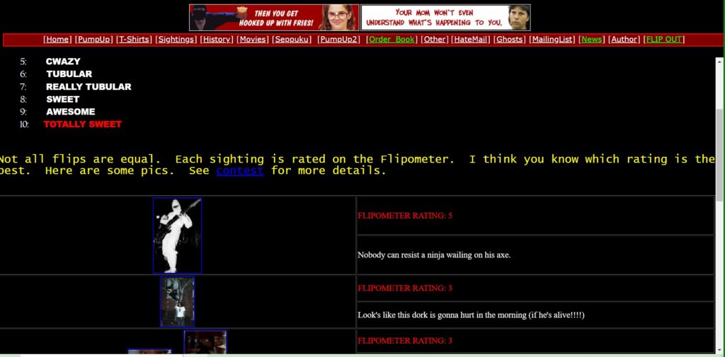
Images are often presented in a comically small aspect ratio. The “Sightings” section, for example, presents utterly tiny thumbnails which do not always open up to full-sized images. As such, get ready to squint.
Words
Despite the copyright notice of 2021, not much has changed on RUP since it was first launched in 2002. More content has been added since then, of course, but all primarily within the first year or two of the site’s launch, and all in the same affected voice of an extremely hyperactive teenage boy.
From his bio, the author:
…has a black belt in Street Fighter 2 and a second degree black belt in Mortal Kombat 1-3. He can kick or punch the wall without feeling pain. He has studied ninjas for several weeks and has watched a bunch of movies about them…
Robert Hamburger, Real Ultimate Power
The rest of the prose is a combination of bombastic exaggeration, run-on-sentences, and imaginative non-sequitors. Real Ultimate Power has been described as “fratire” (fraternity + satire) and as such is presumably meant to appeal to a sort of immature inner child, and a particularly male audience at that, but it does so with near pitch perfection.
Key excerpts include:
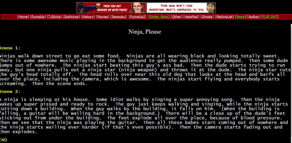
A ninja is sleeping at his house. Some idiot walks by singing a super annoying song. Then the ninja wakes up super pissed and ready to rock. The guy just keeps walking and singing, while the ninja starts cutting down a building. When the guy walks by the building, it falls on him. (When the building is falling, a guitar will be wailing hard in the background.)
Robert Hamburger, Real Ultimate Power, Pump Up 1: Ninja, Please; Scene 2
…the music really pumps up. The audience knows this guy is dead meat for sure. But out of nowhere, the old idiot pulls off his jacket to show that he is a pirate with lasers and everything. The ninja is like yeah right who cares…
Robert Hamburger, Real Ultimate Power, Pump Up 1: The Ultimate Battle, Scene 1
…when they dance, the pirates look like a bunch of crabby and stupid moms. Everybody in the entire world craps their pants laughing at the pure stupidity of the pirates. But the ninja has A.D.D. and starts losing energy/power and the pirates start stopping dancing. (There will be some suspense filled violins and guitars playing so that the audience gets scared and/or pumped-scared.) In several motions, the pirates come toward the ninja. BUT, out of nowhere this bad ass lake appears and a huge hippo busts out of it hard.
Robert Hamburger, Ral Ultimate Power, Pump Up 2: The Pirate Dance, Scene 1
While juvenile in tone, the author nevertheless keeps most of their paragraphs short and “chunked,” using white space (or rather black space in this event) to keep text units distinct from one another. The tone can be described as “conversational,” though with an appropriately self-absorbed bent that suggests the author is more enamored with writing the words than with having them understood, as befits the adolescent voice in play.
Links
Welcome to an Internet graveyard.
Many, and I mean many of the external links are dead. Those pointing to “movies” are non-existent. Doubtless this results from years of neglect, not that this is necessarily an excuse – it only points more tightly to RUP’s dead-site status. We can ignore the dead links if we so choose: what we can’t ignore is the presentation of those links.
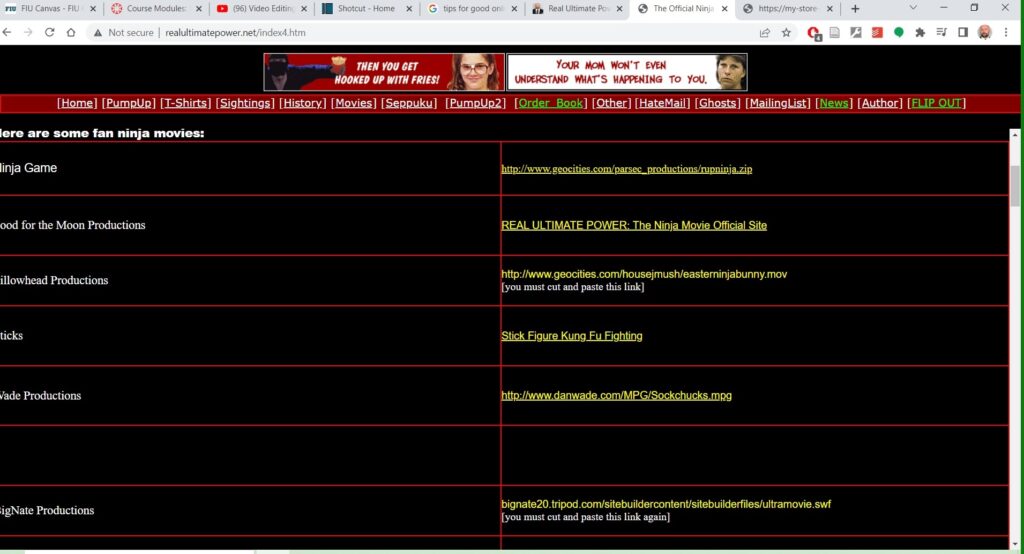
In terms of accessibility the links are a blend of semi-useful titles (e.g. the title of a book with a link to amazon) and full-on URLs, which rank very low for accessibility. The good ones aren’t great, and the bad ones are dreadful.
Atop that is the placement of, well, anything – the home navigation bar looks, and is, chaotic. Links are presented with no sense of order, and as mentioned previously: some are green, some are white, and they don’t change once selected.
On mobile? Forget about it. This site is in no way shape or form optimized for mobile.
Conclusions
It’s worth noting, again, that this UX review shouldn’t be taken too seriously. RUP is old – it was launched in 2002 and I don’t think it’s seen a meaningful update since 2004 or so. The author seems to have given up on this pseudonym / persona sometime around 2015, and I am writing this in 2022. Even if the below recommendations were meant to be taken seriously, it’s unlikely anyone would read them.
But what’s worth articulating is the know-the-rules-to-break-them design of the site, and the humor that results. It is a bad site, and it’s a bad site on purpose. It encapsulates a sort of arrogant ignorance that just doesn’t seem possible today. Who ever could be this loud, rude, cocky, and entitled?
What the author truly gets right, then, is a sense of persona – something we use a lot when thinking about who we’re writing for, but maybe don’t consider enough when we think about who is writing.
Online, we all adopt a persona: whether that’s fun and vibrant, dour and wise, smart and aggressive…naturally these personae change from location to location: who we are on Twitter is not who we are on LinkedIn and so on, but it is nevertheless important to think actively about who we are.
Especially if we’re ninjas.
Recommendations
On the one hand, the site author shouldn’t do anything: RUP is a phenomenon. It is what it is, and that’s what it’s supposed to be. But how could it be brought in-line with best practices?
Here’s my top 3
- Clean up links
- This may mean completely eliminating some pages (movies) but at the very least the author should do a full site evaluation to see what’s working and what isn’t.
- Links should be consistent in color throughout the site.
- Links should be organized in a coherent fashion across the top navigation.
- Install a gallery
- When this site was built, web authors basically had to build tables and insert images tediously, by hand. Since that’s not necessary any more, it might be a good idea to install a plugin, like Jetpack or Modula.
- Update Content
- First, the website needs more content – it hasn’t been updated since sometime during the Obama administration. It’s unlikely that the site is attracting many new visitors.
- Second, the website could probably use a disclaimer – much of the writing is arguably misogynistic, and some of it is also quite vulgar. That might work for the brand, but the entire “fratire” brand is pretty much over. A personal missive from the author explaining that 2002 was a younger, dumber time might go a long way towards promoting positive engagement.