
BoingBoing.net is, according to the Wikipedia page describing it:
…[A] website, first established as a zine in 1988, later becoming a group blog. Common topics and themes include technology, futurism, science fiction, gadgets, intellectual property, Disney, and left-wing politics.
Wikipedia; Boingboing.net
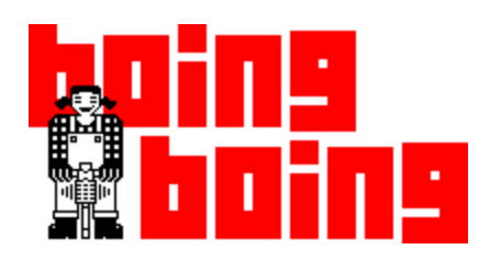
The old Boingboing.net logo featuring the site’s mascot, Jackhammer Jill
As a long-standing media institution, it should come as no surprise that this website offers an excellent user experience: aesthetically consistent, tonally engaged, and graceful in its simplicity.
Reviewing a site like BoingBoing is probably a fool’s errand. BoingBoing has established its brand and has legions of loyal readers. Nevertheless, it’s useful to consider alternatives even when everything seems to be ideal. Consequently, a few recommendations can be found at the end of this report.
Criteria
My guides for evaluation, that is, the works I am citing directly are the basic web-writing guidelines provided by Usability.gov and a helpful article from canva.com I found titled “20 Web Design Principles to Follow” as well as Lynda Felder’s Writing for the Web. Both resources have similar dynamics, which I will describe as needed. In sum, however, I’m looking at the aesthetics, the tone, and the ease-of-use for the Boingboing.net website.
Aesthetics
How does this website look? Key concepts from usability.gov include:
- Use white space. Using white space allows you to reduce noise by visually separate information.
- Chunk your content. Chunking makes your content more scannable by breaking it into manageable sections.
Key concepts derived from the Canva.com article “20 Web Design Principles to Follow” include:
- Use the F (or Z) Pattern.
- Simple and Logical Page Navigation.
- Keep Your Design Consistent.
- Use a Complimentary Color Pallet
Tone
How does this website sound? Key concepts from usability.gov include:
- Use the words your users use. By using keywords that your users use, you will help them understand the copy and will help optimize it for search engines.
- Front-load the important information. Use the journalism model of the “inverted pyramid.” Start with the content that is most important to your audience, and then provide additional details.
- Use clear headlines and subheads. Questions, especially those with pronouns, are particularly effective.
Key concepts from Felder’s Writing for the Web include:
- Tell a Good Story
- Use Active Voice
- Write the Blog You Want to Read
Ease-of-Use
How easy is it to navigate this website? Key concepts from Usability.gov include:
- Use bullets and numbered lists. Don’t limit yourself to using this for long lists—one sentence and two bullets is easier to read than three sentences.
- Use images, diagrams, or multimedia to visually represent ideas in the content. Videos and images should reinforce the text on your page.
Key concepts from the “20 Web Design Principles to Follow” include:
- Simple and logical page navigation
- Optimize buttons and calls-to-action
Evaluation
Boingboing.net looks very basic, which isn’t necessarily a bad thing. It is text-dominant (it is a blog, after all), but the text is never presented as a dense, unassailable wall, and the headlines on the front page are broken up with images.
Every page looks very similar, obeying the same top navigation-content-links model…except for one puzzling exception: the “About Us” page looks very 1990s. Perhaps this is a quirky design touch, but it’s a bit confusing.
BoingBoing.net follows an F pattern for readability (shown below) and uses a complimentary color pallet consisting largely of black-white-and red, perhaps as an allusion to the old joke (What’s black and white and red/read all over?). This simple combination of stark neutrals and bold red makes for an easy-to-replicate, un-busy presentation that makes reading the site very easy. The design does not get in the way of the content.
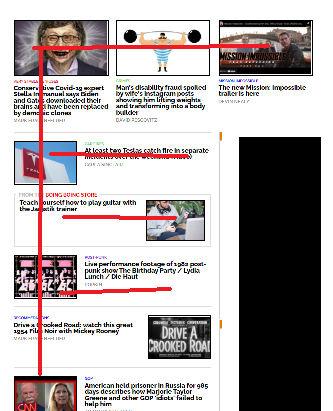
Ad Block notwithstanding, Boingboing.net follows an easily discernible “F” pattern.
Tonally, the whole website is usually aiming for “geek-hip” – the topics are in-line with the site’s mission (tech culture and politics) and focus on burning Teslas, movie trailers, and punk music. Topics which, presumably, are of great interest to BoingBoing readers.
The website is a bit light on navigability features within any given post. The posts are primarily short text excerpts, links, and embeds. In this respect BoingBoing functions more as a content aggregator than a true blog or news site per se. As such it might be better to have more obvious links.
One way in which BoingBoing might better service its readers is to abandon its esoteric links in favor of clear access to external sites. One article, “Restored first video of Smashing Pumpkins performing live in 1988 on public access cable TV” included two links and a video. It was somewhat difficult to determine what action I, the user, should take regarding this content as the links were not completely descriptive.

The jarringly inconsistent “About” page.
Findings
Boingboing.net has enjoyed a longevity few other websites have experienced. A media career of over 30 years obviously comes with its won narrative of success, and so my findings here must be understood as coming from a prescriptive “best practices” approach rather than a success which necessarily validates so-far-so-good experience.
All in all, BoingBoing.net is a fun, hip blog with lots of exciting articles aggregated by knowledgeable curators and distributed via an eye-catching, easy-to-navigate front page.
Calls to action were somewhat ambiguous, however – perhaps a product of the site’s Gen-X authorship. Some articles were simple re-posts with a sort of “hey, check this out I guess” attitude.
Recommendations
Boingboing.net might be better served with a firmer editorial hand and more descriptive links.
For example, rather than simply having the word “this” link to a full-length article, have the entire sentence which describes the article serve as the link. This fits in better with ADA compliance as well.
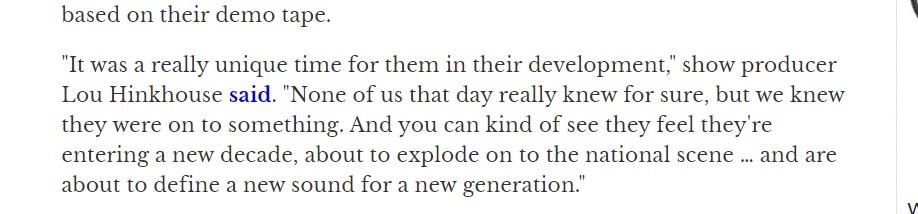
Note that the word “said” links to a full-length article – a link reading “Lou Hinkhouse said in an article posted to SP Codex Wiki” would increase utility and clarity.
SImilarly, while the websites politics and culture are assumed to be understood, some articles lacked an editorial or authorial judgment or statement. While the reader can deduce what’s intended from a close read and via context clues, a novice reader might mistake something like a video post for an endorsement rather than a condemnation.
In the end, any interference with the BoingBoing.net model would only be tampering with success, but as mentioned previously, considerations and evaluations are almost always worthwhile. What’s true today for a website may not be true in 2 years, or even 2 months. As a result, I offer these findings for consideration.