User Test Report
for https://myweb.fiu.edu/lscar008/
Prepared by Zailin Font for Dr. Vytautas A. Malesh and Luciano Scarsi
03/15/2026
Introduction
For this user test report, I spent some time looking through Iscar008 by Luciano Scarsi on the FIU MyWeb platform. I wanted to see how the site works for real visitors and focused on three main things: content, usability, and style. It’s easy to think a good website just needs a cool topic, but if readers can’t understand the information or find their way around, they won’t stick around for long.
The guidelines at Usability.gov recommend that effective websites keep things well-organized, make it easy to get from page to page, and use clear language so people don’t have to hunt for what they need. Writers like Lynda Felder say web content should be short, neatly arranged, and easy to scan with your eyes.
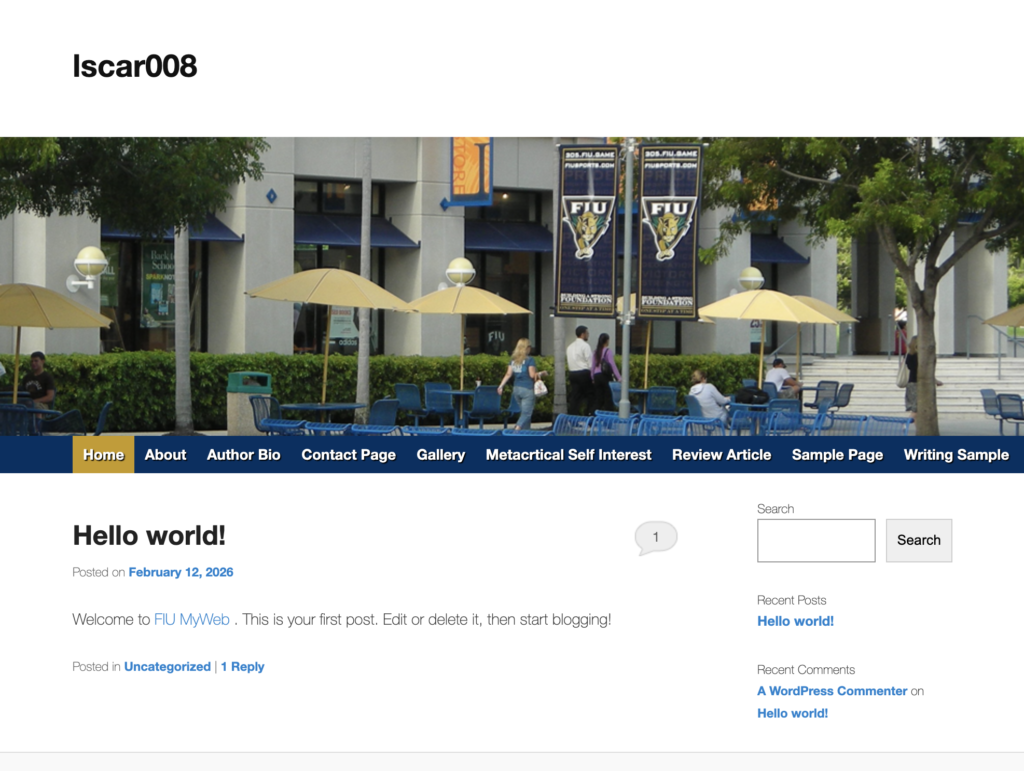
Luciano’s site is all about retro and modern video games, a topic that grabs a lot of people right away. The website already has a clear direction and some eye-catching visuals, but honestly, like a lot of sites in progress, some pages still need more content and a little extra polish to really shine.
Overall Impression
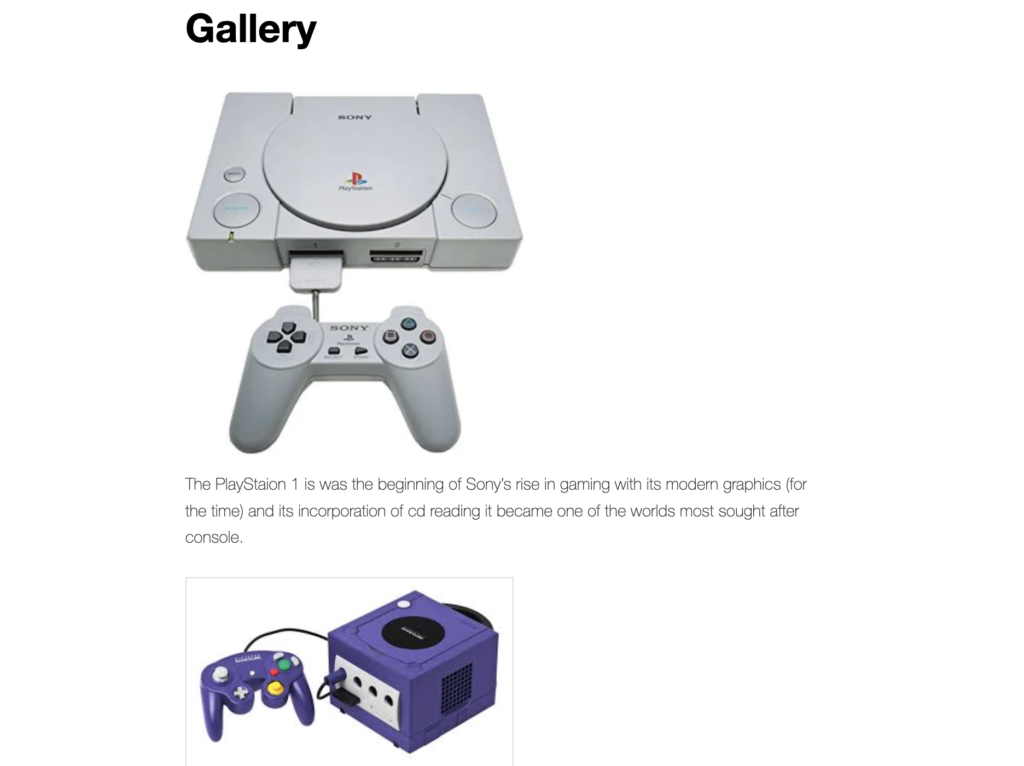
When you open Luciano’s site, there’s no guesswork: it’s all about gaming culture, especially consoles from all kinds of eras. If you’re into games, it feels nostalgic and pretty fun. The photos of the PlayStation and the GameCube set the mood and let you know right off the bat what you’re in for.
Up at the top, the navigation menu offers sections like About, Author Bio, Contact, Gallery, and Writing Sample. These options make it easy to jump between different parts of the site with hardly any trouble.
But, to stick with the metaphor, the site still feels like a game waiting for a new level to load. You can see where it’s headed, but some of the pages need more writing and a little editing. As Janice Redish points out in Letting Go of the Words, people on the web skim way more than they read. So, adding clearer headings, tightening paragraphs, and keeping content focused will make the site pop even more as it develops.
Specific Strengths and Loci of Improvement
Strengths
- Clear Topic- Visitors immediately understand that the site focuses on gaming culture and consoles.
- Strong Visuals- The gallery images support the gaming theme and make the site more engaging.
- Simple Navigation- The top navigation bar allows visitors to move easily between sections like Author Bio, Gallery, and Writing Sample.
- Clean Layout – The site avoids clutter, which makes it easier for visitors to focus on the content.
Opportunities for Improvement
- Expand Content- Some sections are still short and could benefit from more detailed explanations about consoles or gaming experiences.
- Edit for Clarity- A few sentences could be revised slightly to improve grammar and flow.
- Replace Default Blog Content- The default WordPress “Hello World” post should be replaced with original content to make the homepage feel more intentional.
- Consistent Formatting -Consistent Formatting- Keeping headings and spacing consistent across pages would make the site feel more polished.
Conclusions, Affirmations, and Recommendations
Overall, the website already has a strong base and a theme that’s bound to connect with gamers. The retro-meets-modern focus is fun, and images with simple navigation help visitors get the vibe of the site right away.
The next big step is building out more content and cleaning up how it’s presented. Sharing personal takes on classic games, stories about specific consoles, or even quick pieces about gaming history would make the site more engaging. At the same time, small tweaks like proofreading, removing default posts, and ironing out formatting will help it look polished and ready for new visitors.
All in all, the website feels like the beginning of a gaming blog or hub just waiting for a bit more work to grow into a great spot for fans. With a few more updates, it could easily become an entertaining and useful website for anyone who loves games.
Writing this review also encouraged me to step back and evaluate my own website.
👉 Read my self-assessment here: Self-Assessment
Felder, L. (2012). Writing for the Web: Creating Compelling Web Content Using Words, Pictures, and Sound.
Redish, J. (2012). Letting Go of the Words: Writing Web Content that Works.
Usability.gov. User experience basics and web usability guidelines.