Hello everyone! Today, we are going to be evaluating the website “Static Pages, Moving Meaning” by Cheyenne Newfield.
Before we start, I want to talk about what I usually look for in a website. There are two things I find personally important. First, it has to be easy to navigate; there is nothing worse than a website that’s complicated, because then what’s the point of it! Secondly, the writing has to be catchy and entertaining. I am visiting to learn about your interests and the theme of your website, not a research paper.
Now that we have a little bit of a guideline to follow, we can get started!
HOMEPAGE AND OVERALL FIRST LOOK
When you first enter the blog, it is very clear what the topic is. I like how there is a subtitle under the website name that adds more context to the topic. According to The Guardian’s “Top tips for a successful blog” by Katy Cowan, to create a successful blog, you must pick a niche theme that readers and search engines will love. This topic is very specific, and I knew nothing about it before, which drew me into the website.
The homepage’s style is clean and simple, which I feel matches the theme. It is easy to read, and the colors are nice and cohesive. The font is also a good pick, easy to understand and read.
I like how when you first enter the website, the first thing you see is the latest posts, which helps the reader get right into it.
The website itself is organized and easy to use. I was able to find all the content fast with no trouble, thanks to the top menu, but if I ever need to find something even faster, there is a convenient search bar on the homepage.
THE CONTENT AND WRITING
The website has all the required content and exceptional writing.
The topic of the website is something that I had no previous knowledge of, and Newfield’s approaches it in a way that’s welcoming and entertaining
The content throughout the website is very cohesive; I can tell that it was all written by the same author. It was a very distinctive style: smart and clever, with a hint of sarcasm and humor.
Which takes me to my favorite part of the website: its sense of humor. The inclusion of memes and little jokes makes the articles very entertaining and easy to read. I chuckled multiple times while reading. The jokes are also relevant right now and not dated.
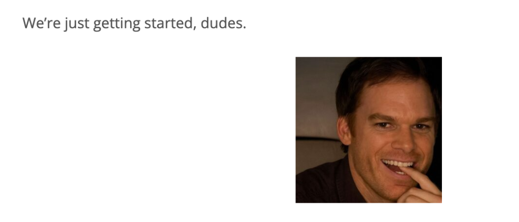
Here’s a hilarious example!
I appreciate the inclusion of images. When talking about rhetoric, it can be hard to add visuals, but the memes work perfectly and add uniqueness to the site.
Before I discuss what can be fixed (it’s not a lot), I want to shout out my favorite article from the site, “Humans Think They Want Control. What They Really Want Is Permission.” It was a thought-provoking read, and I love how it used “Life is Strange” as an example.
WHAT I WOULD CHANGEThe website feels personal and unique, and it’s well organized; there isn’t much I would change about it. If I had to pick something, I would add hyperlinks to outside sources, references, and recommended readings. I think hyperlinks keep readers focused on the topic and offer a different point of view from the website. This article offers a great explanation of how hyperlinks can help make the user experience better.