User Test Report for https://myweb.fiu.edu/fvarg027
Prepared by Sophia Linares for Dr. Vytautas A. Malesh and Felipe Vargas
March 15, 2026
Introduction
This report evaluates the website Warbound: Diaries, created by Felipe Vargas. The purpose of this user test report is to look at how the site functions as a web project, including how the content is presented, how easy it is to navigate, and how effective the overall design is for readers. The site focuses on building a fictional fantasy world called Warbound and includes several sections such as blog posts, writing samples, a gallery, and contact information. Overall, the site already has a strong theme and a lot of creative content. At the same time, there are a few areas where the layout and formatting could be improved to make the reading experience smoother for users. This report will first discuss the overall impression of the site, then identify specific strengths and areas that could be improved.When evaluating the site, I considered general web usability principles such as readability, navigation clarity, and visual hierarchy, which are important factors in creating effective websites (Usability.gov).
Overall Impression
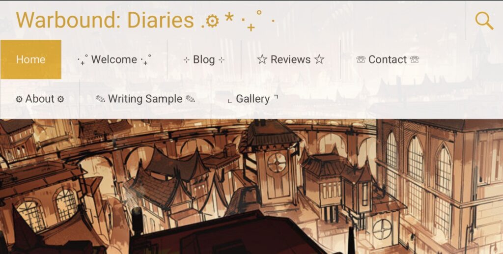
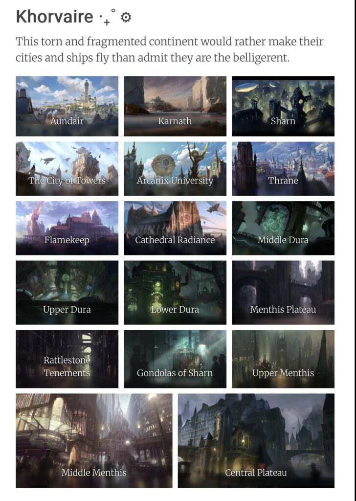
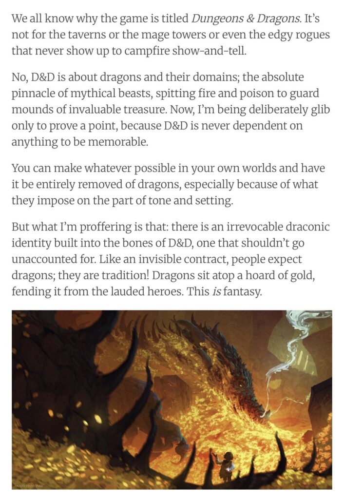
The first thing that stands out about Warbound: Diaries is how clear the theme of the site is. The design, artwork, and color choices immediately give the reader the feeling that they are entering a fantasy or steampunk world. The images used throughout the blog posts and gallery help build that atmosphere and make the site visually interesting.
The navigation bar at the top of the site also works well. Pages like Home, Blog, Reviews, Writing Sample, Gallery, and Contact are easy to find, which makes it simple for users to explore different parts of the website. The blog posts themselves include artwork and detailed writing, which makes the content feel immersive.
However, some of the posts include very long paragraphs, which can make the pages feel a little heavy to read online. Since most people scan websites rather than read every line, breaking some of that text into smaller sections would make the content easier to follow.
Specific Strengths and Loci of Improvement
Strengths
• Strong visual theme – The fantasy and steampunk style is consistent across the site. The images, colors, and layout all support the tone of the fictional world.
• Clear navigation – The menu at the top of the site makes it easy to move between pages like the blog, gallery, writing samples, and contact page.
• Good use of visuals – The site includes many illustrations and even a YouTube video, which helps make the pages more engaging and breaks up the text.
• Creative content – The blog posts and writing samples show a lot of world-building and storytelling, which makes the site feel like a developed creative project.
Areas for Improvement
• Long paragraphs – Some blog posts contain large blocks of text. Breaking these into smaller paragraphs would make them easier to read on a screen. According to usability research, users tend to scan online content rather than read every word, so shorter paragraphs and clear headings improve readability (Nielsen Norman Group).
• Content organization – Adding a few more headings or sections within longer posts could help guide readers through the content.
• Busy sidebar – The sidebar includes search, recent posts, comments, archives, and categories. While these are useful, they make the side area feel a bit crowded.
• Homepage explanation – A short introduction explaining what the Warbound project is could help new visitors understand the site right away.
Conclusions, Affirmations, and Recommendations
Overall, Warbound: Diaries is a creative and visually interesting website that clearly shows the author’s effort in building a fictional world. The strong theme, artwork, and storytelling make the site engaging and give it a clear identity. The navigation is also simple enough that users can easily explore different parts of the project.
To improve the site further, the author could focus on making the written content easier to read online. Shorter paragraphs, clearer section breaks, and slightly simpler page layouts would help visitors move through the information more comfortably. Adjusting the sidebar layout could also make the pages feel less crowded.
Even with these areas for improvement, the site already does a good job presenting a creative project and shows a lot of potential as it continues to develop.
Works Cited
Nielsen Norman Group. “How Users Read on the Web.” Nielsen Norman Group, https://www.nngroup.com/articles/how-users-read-on-the-web/.
Usability.gov. “User Interface Design Basics.” Usability.gov, https://www.usability.gov/what-and-why/user-interface-design.html.